
Inside arun.is · Apple Watch animations
7 min read Aug 30, 2024
This is part of an ongoing series about how this site is made.
Series
Note
If you know a better way of solving any of the problems I discuss, please let me know!
A few years ago, my wife gave me my first Apple Watch. Up till then, I was an admirer of the watch world, but hadn’t gone very deep aside from purchasing a few vintage Braun wristwatches.
With the Apple Watch on my wrist, I got more curious about how its faces are inspired by real-world watches. In some cases, I didn’t even know how to use a face. I started researching how to use each face and inevitably fell into rabbit holes about history. The information I compiled lead to one of the most popular posts on this site.
The post ended up being over 3,000 words and over 30 photographs, illustrations, and videos. When crafting the cover image for the piece, I knew I needed something that would match the hours I spent researching and writing the piece.
Initial concept
I first played around with static images of the Apple Watch and made several variations.
That’s when I had the idea of animating the watch face to match real life. I started out with the watch facing forward.
However, I felt a bigger challenge and better looking result would be the watch at an angle. To make it even better, I decided to transition between the five different watch faces, instead of showing just one.
Watch case and band
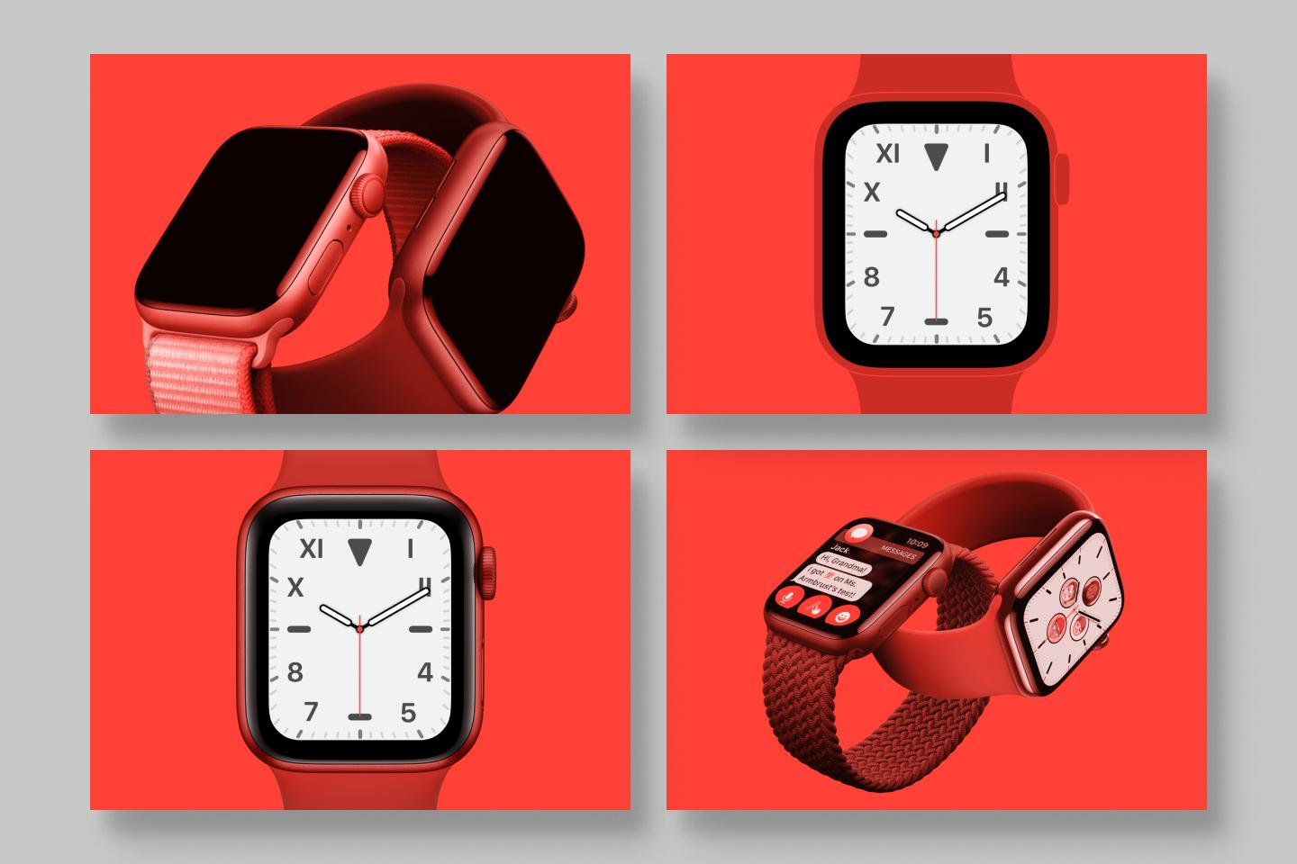
I found a suitable image of a blue aluminum Apple Watch with the then-new Braided Solo Loop. But, the blue wasn’t going to work with the post’s red color theme. I made some adjustments in Figma to fit the red background.
First I slightly lightened the highlights and the shadows to make the braided loop shine a bit more. Then I added a red hue adjustment layer, which shifted the hue, but still looked a bit desaturated. So, I added a red color adjustment layer, which made the watch more saturated.
Finally, I filled the apple watch face with black to make a blank canvas.
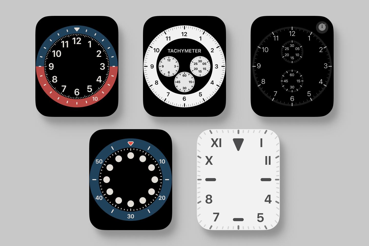
Redrawing the faces
The next step was the most time consuming — redrawing each watch face.
I started with a screenshot of each face and then redrew them in Figma. I made sure to separate out the elements into two groups. First are the static elements like bezels and indices, with a separate group for each face. Second are the moving hands.
Animating the faces
I exported it all as one SVG. This made it easy to use the existing build system
for my blog, where each post has a cover image defined. I opened up the SVG in
my text editor to hand code the animations. I made sure that each individual
element that I wanted to animate had a unique id that I could use later on in
CSS, e.g. <g id="second_hand">.
I animated each element separately in an embedded <style> tag, matching
real-life movement. Seconds hands make one revolution per minute, while minutes
hands make one per hour, etc.
These are implemented as a keyframe animations, making sure to correctly set the
transform-origin for each element since. Here’s an example:
#second,
#chronograph_seconds_hand,
#chronograph_pro_hand {
  animation: spin_seconds 60s infinite linear;
}
@keyframes spin_seconds {
  0% {
    transform: rotate(0deg);
  }
  100% {
    transform: rotate(360deg);
  }
}
#second {
  transform-origin: 50% 50%;
}
#chronograph_seconds_hand {
  transform-origin: 360px 297px;
}
#chronograph_pro_hand {
  transform-origin: 360px 301px;
}
To transition between the different faces, I again used keyframe animations. I made sure that the animations overlapped, meaning that as one face faded out, another faded in. This was achieved by using several different keyframe animations with the same time length, but with different points where opacity is 1. Here’s an example of one:
#chronograph,
#small_dot,
#chronograph_hand,
#chronograph_seconds_hand g {
  animation: chronograph 20s infinite linear;
}
@keyframes chronograph {
  0% {
    opacity: 0;
  }
  35% {
    opacity: 0;
  }
  40% {
    opacity: 1;
  }
  55% {
    opacity: 1;
  }
  60% {
    opacity: 0;
  }
  100% {
    opacity: 0;
  }
}
With the animations done, all that was left was figuring out how to distort the animated SVG to fit.
 The animated SVG
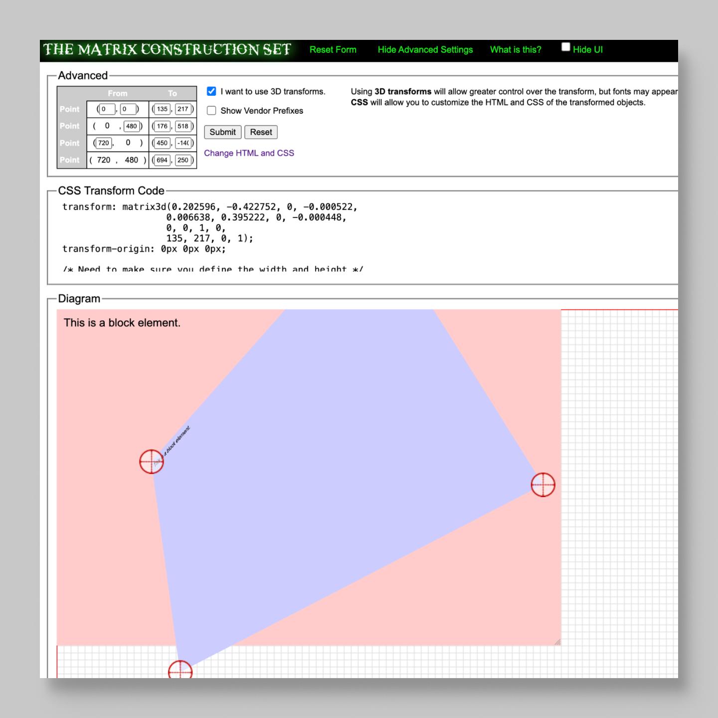
Perspective transform
After scratching my head and poking around the internet, I stumbled upon
The CSS3 Matrix Construction Set. It
allows one to define a rectangle of a specific size and then either distort it
by dragging the corners around or inputting specific corner coordinates. The
output is a matrix3d CSS transform that achieves that exact transform.
To figure out the coordinates, I turned to the Free Transform tool in Adobe Photoshop. I first added the background image and then a Smart Object layer above it. I dragged each of the four points around till it looked just right.
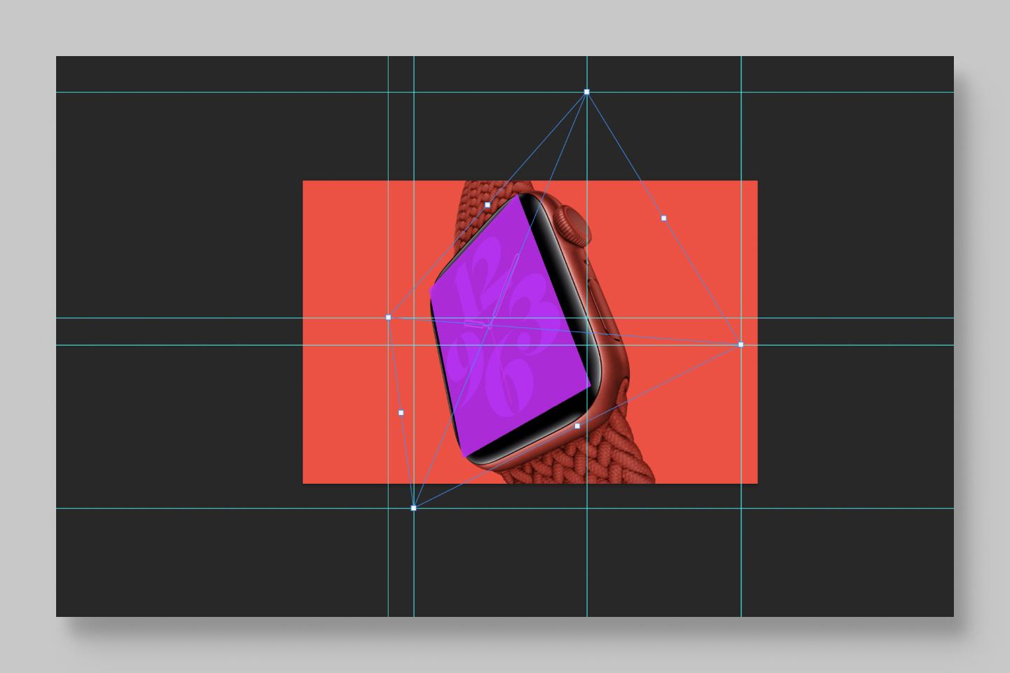
Since my second layer was a Smart Object, I could switch between different
overlays like one of the watch faces I drew in Figma, or a simple translucent
rectangle. With the help of guides, I was able to identify the exact points for
each corner and input it into the Construction Set, resulting in a matrix3d
transform like the following.
--watch-skew: transform:
  matrix3d(
    0.202596,
    -0.422752,
    0,
    -0.000522,
    0.006638,
    0.395222,
    0,
    -0.000448,
    0,
    0,
    1,
    0,
    135,
    217,
    0,
    1
  );
Putting it all together
Next came the tricky task of putting it all together. I needed some way of overlaying my animated SVG on top of the raster image of the watch case and band. Previously I have converted my .jpg background to base64 and embedded it directly in the SVG. This method is fine when the .jpg is small, but in this case the result was large and difficult to open and edit.
Instead I opted to absolutely position my animated SVG overlay. Here’s some example HTML and CSS.
<div class="cover">
  <div class="image-container">
    <img src="images/cover.jpg" class="image" />
    <img src="images/overlay.svg" class="overlay" />
  </div>
</div>
:root {
--red: #ff4136;
--image-width: 720px;
--watch-skew: matrix3d(
0.197006,
-0.422127,
0,
-0.000534,
0.007764,
0.399111,
0,
-0.00044,
0,
0,
1,
0,
135.1,
217.65,
0,
1
);
}
.cover {
background-color: var(--red);
}
.image-container {
max-width: var(--image-width);
position: relative;
margin: 0 auto;
}
.image {
display: block;
width: 100%;
}
.overlay {
position: absolute;
inset: 0 auto;
width: var(--image-width);
transform-origin: 0 0;
transform: var(--watch-skew);
}Unfortunately, this only works when the screen is wider than 720px. At smaller widths, the absolutely positioned overlay is too big. I tried some different ways to solve the problem when I had the idea of scaling the overlay to fit. I first tried calculating the scaling factor like below.
.overlay {
  transform: scale(calc(720px / 100vw));
}
Unfortunately, this doesn’t work due to units present in each number.
Fortunately, there is
a CSS-only workaround
using the tan() and atan2() formulas.
@property --100vw {
  syntax: "<length>";
  initial-value: 0px;
  inherits: false;
}

:root {
  --red: #ff4136;

  --image-width: 720px;
  --image-width-unitless: tan(atan2(var(--image-width), 1px));

  --100vw: 100vw;
  --current-width: tan(atan2(var(--100vw), 1px));

  --scale: scale(calc(var(--current-width) / var(--image-width-unitless)));

  --watch-skew: matrix3d(
    0.197006,
    -0.422127,
    0,
    -0.000534,
    0.007764,
    0.399111,
    0,
    -0.00044,
    0,
    0,
    1,
    0,
    135.1,
    217.65,
    0,
    1
  );
}

.overlay {
  position: absolute;
  inset: 0 auto;
  width: var(--image-width);
  transform-origin: 0 0;
  transform: var(--scale) var(--watch-skew);
}

@media (min-width: 720px) {
  .overlay {
    transform: var(--watch-skew);
  }
}
Full example available on GitHub. See the animated Apple Watch live here.
Looking ahead
Figuring out the general techniques outlined in this post opened up the possibility of doing similar things in other places. I have used it in the post about the Metropolitan Apple Watch face and hope to use it in other places as well.
Thanks to Q for reading drafts of this.